
Shared by eszpee
Színes vs. fekete-fehér fotózás, kicsit aggresszív a faszi stílusa, de a végén a "tesztek" rendben vannak.
As everyone knows, black and white is better than color.*
Now, I know that in some cases, color is…warranted. A naturalist—who was also a nature photographer, and note that the two aren't the same thing—once made the argument to me that the colors of the animals and the plants he photographed were part of the essential visual information he needed to capture and convey about his subjects, a position I dubbed "the bird-feather argument." I grant the bird-feather argument: it's important to know whether a bird is brown or red. There are a number of other reasons why color might be warranted. Although it isn't my intention to enumerate them here, one more I might mention is that sometimes color allows you to pack more information into the frame of a picture, for instance in the color pictures in this post.
The two classic raps against color (you come across them again and again in the literature) are that it is "too decorative" or that it is "too literal." These strike me as true controversies, because they live on and on.
There's also the undeniable fact that some photographers are good at color. They see it well, understand how it works, and manage to integrate it into what they choose to take pictures of. In these all-too-rare cases, color is not just warranted, it is (and this always surprises me) desirable. But if you ask me, color in photographs is still like seeing large numbers of people out in public dressed in clothes that are way too revealing—although occasionally a treat, for the most part I'd just really rather not see it. It falls into the category of "too much information."
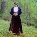
Take this photograph by Udayan Behera and published online in National Geographic.com's Your Shot —> The Daily Dozen.

Ack! It's an interesting shot, well seen, and it looks like an interesting place. But do I really need to see so much of this horrible color? Coloristically, it has the charm of a lump of mucus, or something that grows on old bread. Like some old fat dude in a Speedo, I'd really rather not see it.

Ah. Much better.
Some things are just better left to the imagination.
I will admit that a lot of pictures are color/B&W neutral. They can be either-or. That's probably because the huge majority of them, like the huge majority of all photographs, aren't art, don't pretend to be art, don't function as art. I really don't give a kick whether Herman Q. Publique takes his vacation scenics, or his missus, Gertrude O. Publique, takes the kiddies' birthday pictures, in color, or not. It doesn't concern me. Until the rise of photo-sharing sites, I never got dragged into it.
More often than not, color ruins pictures. And here's why: photographers are color junkies. Give the average Herman or Gertrude a color camera, and all judgment flies out the window. Suddenly, all kinds of things previously recognizable as not being a picture become flat-out irresistible. Why? Why, just because it's a color. Instantly, everyone's a bleedin' Ellsworth Kelly. We'll call this Johnston's Curmudgeonly First Law of Kelly Color: Color distracts, and bright, saturated primary colors distract absolutely. I think when I'm old and terminally crotchety and running around half-addled with Oldtimers, whenever I see someone taking a picture of red flowers I'll probably chase them off with my cane. ("Yes, officer. I was taking a picture of those tulips over there when that old coot charged me brandishing his cane and yelling 'Don't do that! Stop that!'")
Did you know that all those austere white stone buildings that have lasted from ancient Rome and ancient Greece weren't really white? Scholars think that, in their time, they were painted all sort of lurid colors. People love color.
 To call color pictures "too decorative" or "too literal" is to start with the work and proceed from there. Me, I always start with photographers. They're who I care about. So I have two suggestions for people who routinely photograph in color. First, when you get a photograph you think might be a keeper, go into Photoshop and convert it to black and white.
Oh, now, calm down, Festus, I'm not saying you should leave it in black and white—just look at it that way for a while. You can change it back.
But this'll tell you something important. Because if it's not a picture in black and white, chances are pretty good that it's also not a picture in color, either.
(There are exceptions. Let's not dwell on that.)
This portrait, for example, still looks like a picture to me in black and white. So far so good.
Second, convert it back to color and apply massive amounts of Gaussian blur to it. Like a radius of 60 pixels or so.
![]()
Again, I'm not suggesting you leave it that way. (Duh.) But this will let you see the colors more or less by themselves. Again, just look at it that way for a while. Do the colors work as colors? Any clashes? Are the colors ugly or appealing?
If the picture's colors were stripes on a tie, would you wear the tie?
(Or think to yourself, "Would these colors make Mike say 'Eww'?" Don't take umbrage, Evangeline, I'm just kidding.)
Doesn't matter how you think about it. Just look at it. You'll figure it out.
Finally, consider the color version compared to the black and white version. Does the color add anything? A sense of light, a warmth, a feeling-tone, anything? Any positive reason for it at all?
You don't need to write comments and tell me smugly how nobody's going to do this. I know they won't. Junkies just need their fixes. But these aids would help people understand their color pictures better if they did them every once in a while. With color goes responsibility…or would, in a more perfect world.
_______________________
Mike
*Relax. Breathe. Now, slowly, calmly, go get your blood-pressure medication.


Utolsó kommentek