Anyuka helyén marad!

Utolsó kommentek

  • Pénztörténet: www.youtube.com/watch?v=Fpk35NO5WtE&feature=share&list=UU86sMRBpLe1Xteg1GVXg12A&index=3 (2013.12.23. 13:15) Árulás és koncepciós per az ezerforintoson
  • sztahanov: tudni kell mikor feladni, en pl most harom ora keresgeles utan feladtam. (2010.08.25. 22:58) Blob
  • sztahanov: ez mar jobb, de most dolgozom epp :-) (2010.08.25. 12:45) Blob
  • Utolsó 20

Friss topikok

  • Pénztörténet: www.youtube.com/watch?v=Fpk35NO5WtE&feature=share&list=UU86sMRBpLe1Xteg1GVXg12A&index=3 (2013.12.23. 13:15) Árulás és koncepciós per az ezerforintoson
  • sztahanov: tudni kell mikor feladni, en pl most harom ora keresgeles utan feladtam. (2010.08.25. 22:58) Blob
  • Gm: :))) (2010.03.21. 19:33) Szakácskések I. – A séfkés
  • gasztromán: Nagy örmmel olvastam a boltról a cikket! Én is felfedeztem, kb. fél évvel ezelőtt. Tényleg unikum ... (2009.07.29. 23:47) azbeszt - Marha jó!
  • burqus: Köszi a poszt beidézését és a jó hír terjesztését. Viszont a képeken egérmozgatásra felpattanó abl... (2008.09.28. 18:03) A legjobb kínai vendéglő

Twitter

Nincs megjeleníthető elem

Címkék

api (1) biz (4) blogok (3) bookmarks (1) dizájn (4) facebook (13) feedek (19) friendfeed (1) gmail (3) google (19) iphone (4) kommentek (8) labels (1) myspace (3) nokia mosh (1) openid (2) orkut (1) sn (54) start (3) twitter (3) ui (8) videó (2) widgets (1) yahoo mash (1) Címkefelhő

Scobleizer

Nincs megjeleníthető elem

izotov

Google Reader shared items

filter
admin

Külső feed

Nincs megjeleníthető elem

Google Reader Starred

Doransky

Nincs megjeleníthető elem

Orkut Redesign

2007.10.08. 11:40 Google Blogoscoped sztahanov

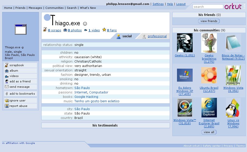
Google yesterday announced they’ll be rolling out a new look for their social network Orkut. It’s only being shown to a small portion of users right now. I can’t see it, for instance, but others now posted their screenshots, like the one below by Info-Mundo.net (Creative Commons licensed).

Old design

New design

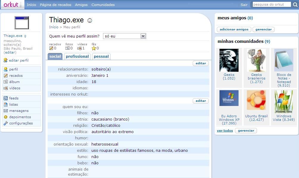
Shown above is user “Thiago.exe”. This is not the homepage you see when you log-in, which contains less information, but the profile page of that user. In the new design, many of the edges have been rounded off for a smoother look. The custom, more playful first letter in Orkut style has been removed. The top bar, displayed in Portuguese here (Orkut is very popular in Brazil), wraps up some of the main functionality and integrates a search box. The three tabs social, professional, and personal moved a little bit lower, and look more traditionally tab-like than before. The blue and cyan color tones got a little bit more fresh and lighter, and there’s some additional shades and gradients throughout the page as well.

Címkék: ui orkut sn

A bejegyzés trackback címe:

https://izotov.blog.hu/api/trackback/id/tr29189948

Kommentek:

A hozzászólások a vonatkozó jogszabályok  értelmében felhasználói tartalomnak minősülnek, értük a szolgáltatás technikai  üzemeltetője semmilyen felelősséget nem vállal, azokat nem ellenőrzi. Kifogás esetén forduljon a blog szerkesztőjéhez. Részletek a  Felhasználási feltételekben és az adatvédelmi tájékoztatóban.

Nincsenek hozzászólások.
süti beállítások módosítása